03/17
SISU
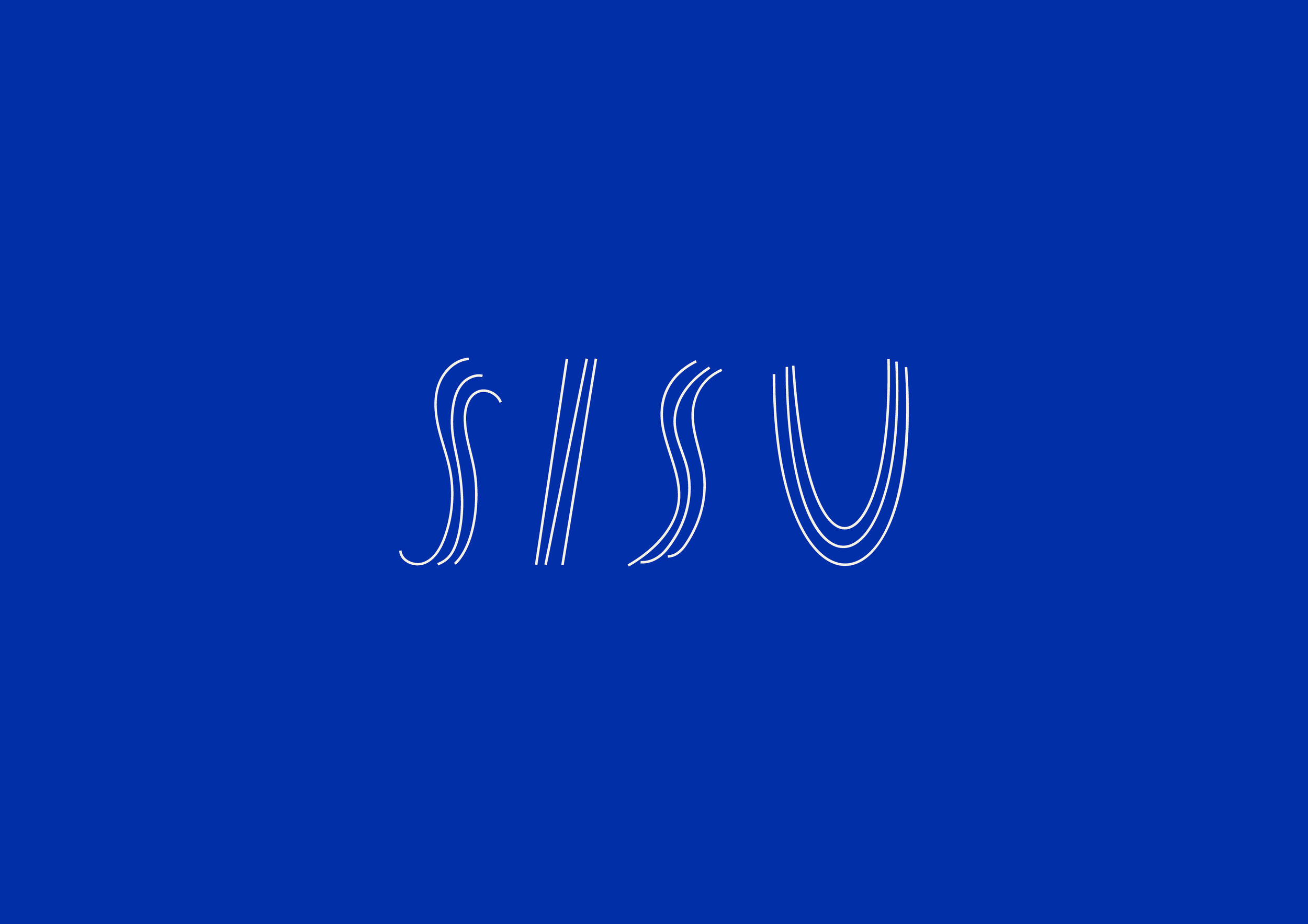
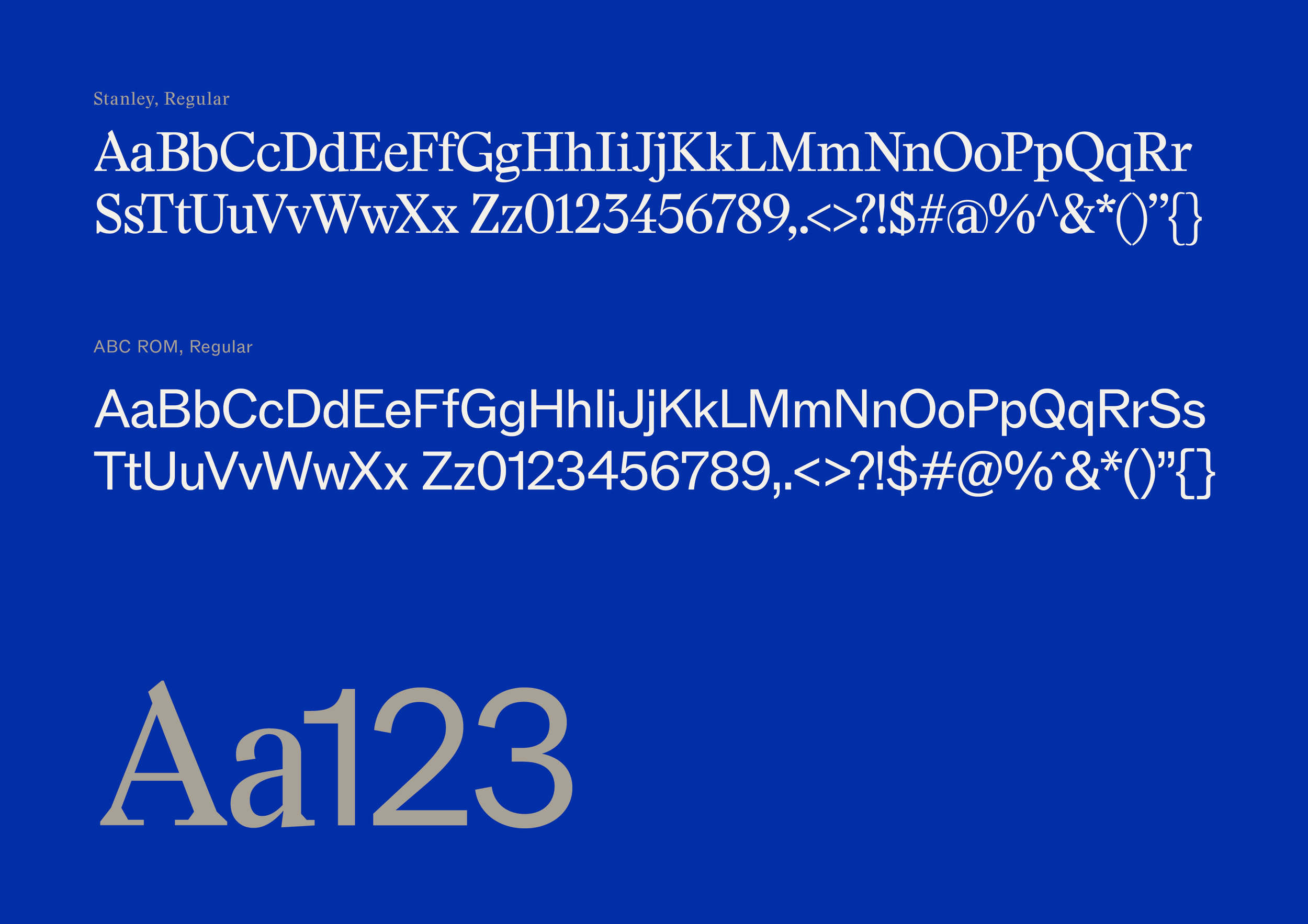
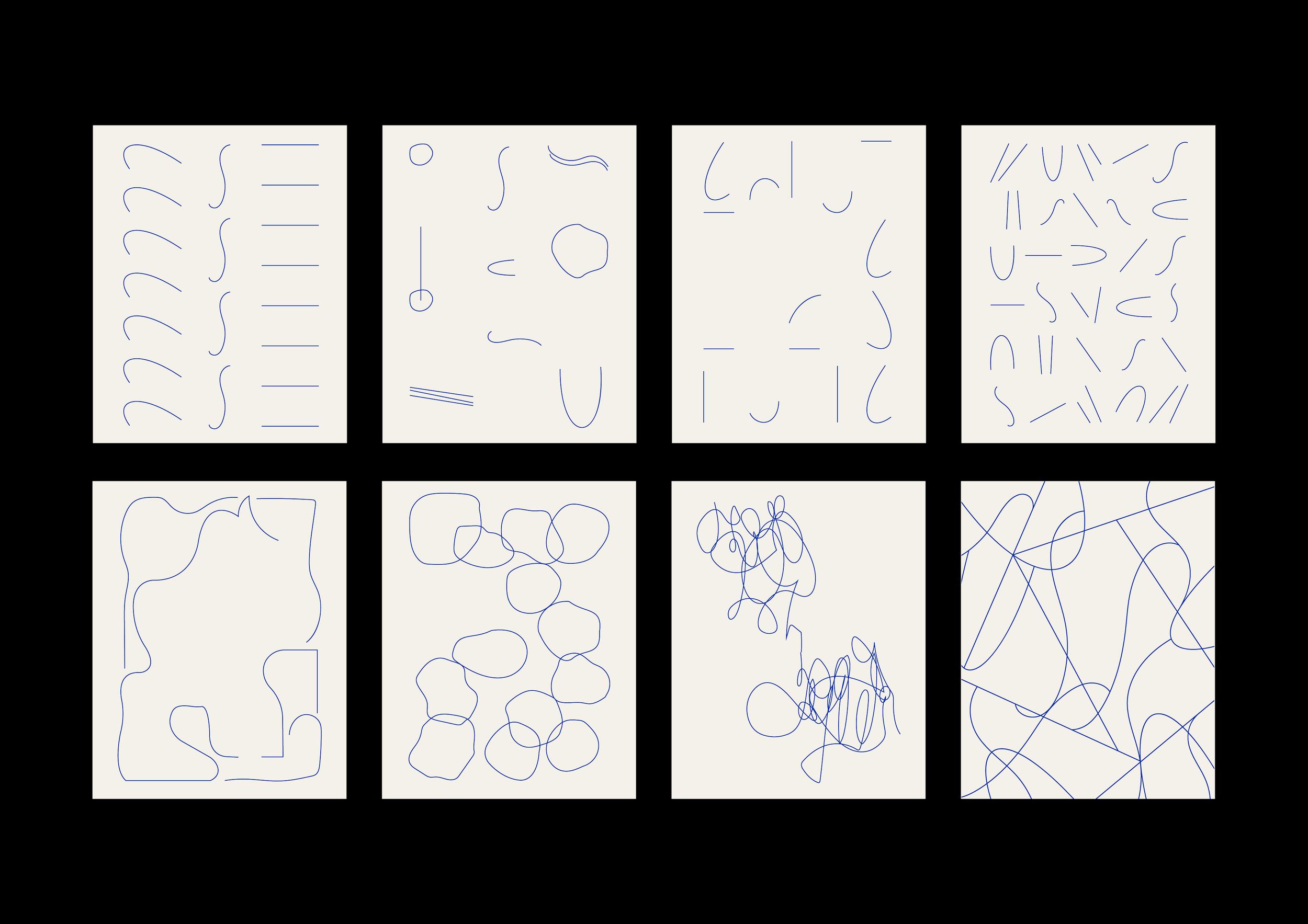

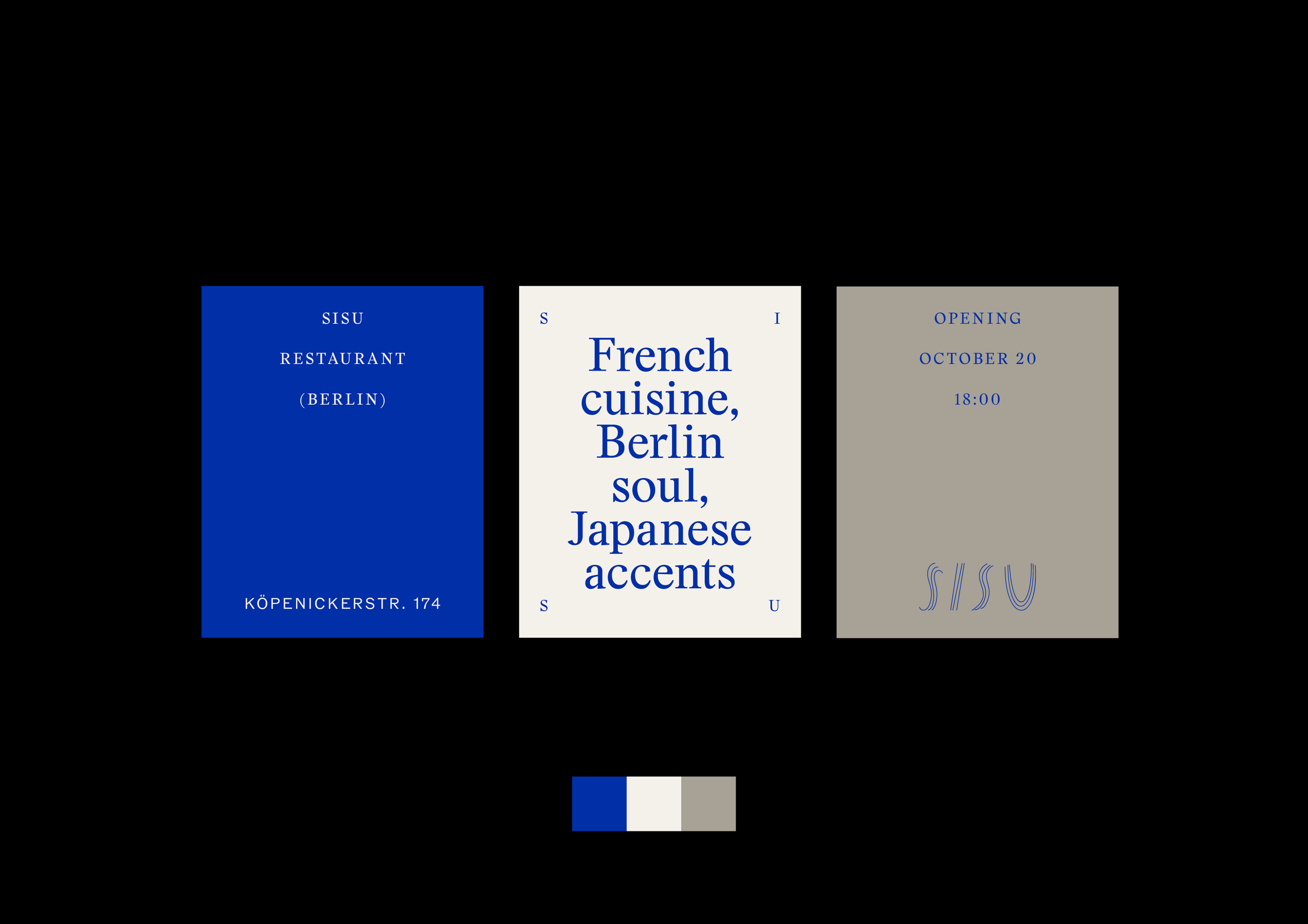
SISU is a restaurant in Berlin, connecting European tradition with Japanese influence - a place where gastronomy, music, art and culture come together. In Finnish, sisu represents inner strength, resilience and the courage to follow your own path without needing to be loud. The visual identity translates this idea through expressive scribbles, organic tree-root textures and the spiral symbol with a focus on character and artistic expression. As a universal symbol of resilience, the spiral represents the ability to “bounce forward,” while the tree embodies strength through adaptation - bending without breaking. In the logo, these ideas come together through the texture of the tree bark and the roots, which gradually transform into loose, hand-drawn lines. The tree also references the restaurant’s wooden ceiling, creating a direct connection to the physical space. The resulting mark has a raw, sketchbook quality that reflects food as a creative process, where making and experience are closely connected. Sleek typography and a grounded colour palette balance the organic logo, giving the identity a refined, high-end character.
Role: Art Direction, Brand Identity, Graphic Design